About the project
The healthcare workforce faces an overload of work, shortage of staff, and poor work-life balance. Among them, managing patients and handling appointments is one big issue. In addition, most of the tasks including managing patient files and transcripts are still done manually. GetWell targets patients, doctors, nurses, and hospital staff to do their manual work easily.
This is a project I contributed end-to-end design through research, wireframing, visual design, prototyping and testing.
Role
Tools: Pen & paper, Figma
Overview
Although there are a number of world famous dating apps, Sri Lankan people are not comfortable using those. In a more culturally bound country, people need a platform to find their better halves. We found that people are searching for partner for serious relationships which lasts longer with a beautiful marriage. Due to trust and privacy issues, people still use newspaper matrimonial advertisments to find partners. All are searching for a platform that could win their trust and feels more secured. Therefore, there is a huge need for a platform that accustomed to Sri Lankan culture.
Solution
GetWell is a patient management app where patients can book their doctors and patients can keep their health reports and data at one place. For the MVP, patients can book their preferred doctors, maintain their health records in the app, and the doctors can view their daily schedules and add data and reports to their patients. Moreover, nurses and the admin staff can register patients and help managing patients.
DESIGN PROCESS

Following the design thinking methodology helped me to design products with better experience. Understanding user’s needs, struggles, and challenges helped me to design a usable, discoverable, and understandable product. Based on design thinking, I followed design sprints as a methodological process, which helped me to tackle and solve problems in the most efficient way within a specific time range.
USER RESEARCH
I conducted interviews and created empathy maps to understand the users I’m designing for and their needs. A primary user group identified through research was people who usually visit hospitals monthly.
This user group confirmed initial assumptions about GetWell users, but research also revealed that scheduling was not the only factor that make hospital experience awful. Other user problems included keeping health records, finding suitable doctors, or challenges that make it difficult for doctors to give a better service for the patients.
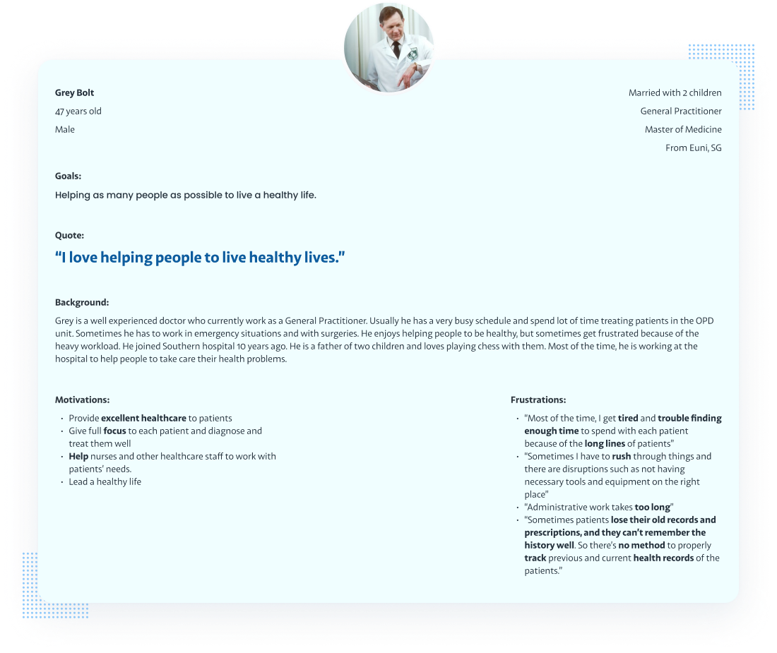
PERSONAS
Based on the research analysis, I identified 3 user personas. They helped in driving the design decisions by identifying their common needs and pain points.
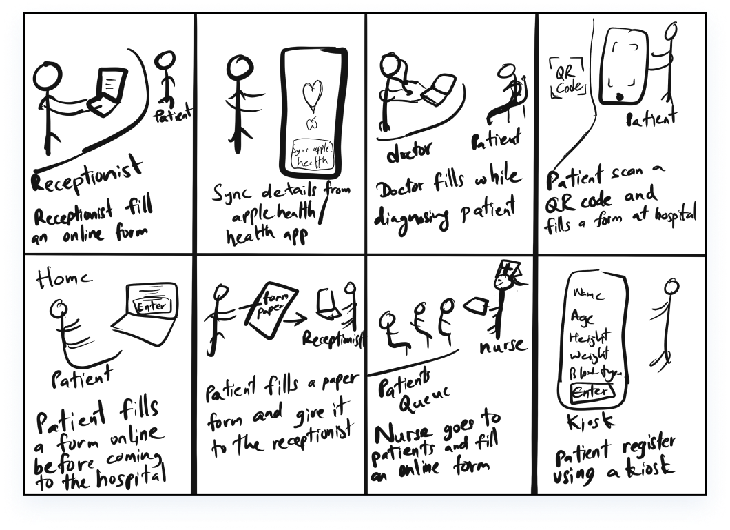
IDEATION
We sketched out some concepts for our app’s design based on what we learned about our users in the empathize stage using the Crazy 8’s approach. We rapidly brainstormed multiple creative solutions based on what we learned from our research to identify various ways we could begin designing.
USER JOURNEY MAP
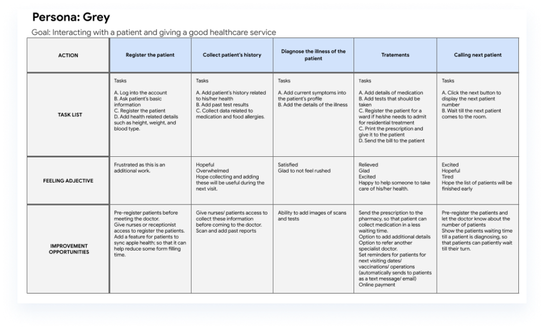
User journey maps helped me understand the context of users and gave a clear picture of the steps the users would go through when engagaging with the product.
Here’s a quick view of one of the user journey maps. Mapping Grey’s user journey revealed how helpful it would be for doctors to have access to a dedicated app where they can view their workload and patients’ health records.
WIREFRAMES
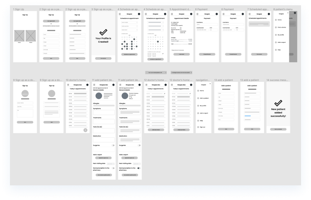
In this stage, we created the first levels of the design using what we knew about our users and their needs. I started with paper wireframes and then improved them to low-fi digital wireframes.
PROTOTYPE
In this version, the lo-fi digital wireframes from the previous step were connected together into a working prototype. We used this lo-fi prototype for our initial testing phase.
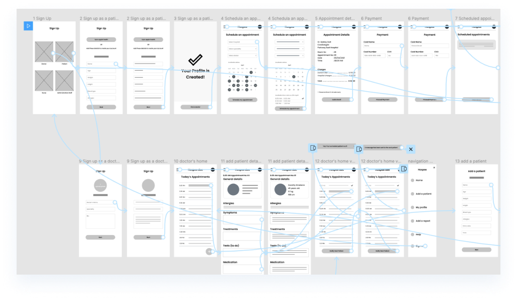 View lo-fi prototype
TESTING
Our goal was to figure out what difficulties users encountered when trying to complete core tasks in the GetWell app, such as booking a doctor, adding a health report, doctors viewing their daily schedule.
We conducted a usability study. A session lasted for 30-45 minutes, including the test and the interview questions. Participants were anyone concerned about their health and who needs to visit doctors usually. We observed the sessions and took notes on their progress and feedback to a spreadsheet.

AFFINITY DIAGRAMMING
Sorting all the findings of the usability test into differenet themes and relationships helped to understand more about user needs, pain points, drawbacks of our current solution, and helped to look further into improvements.
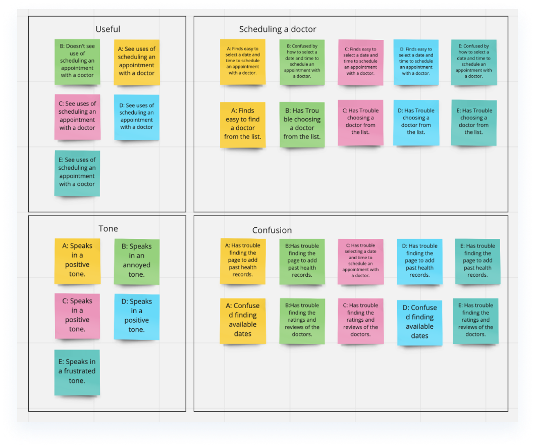
Based on the data from the study, I identified three areas that needed to be addressed:
- Based on the theme that: for most users, it’s not immediately clear what the available dates are, an insight is: users need better cues to understand what dates are available.
- Based on the theme that: finding the most suitable doctor is difficult for almost all users, an insight is: users need an intuitive way and cues to see ratings and reviews of the doctors.
- Based on the theme that: most users were not familiar with adding past health records, an insight is: users need more information and guidance on adding past health records.
HI-FI MOCKUPS FOR THE MVP
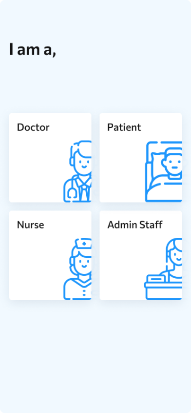
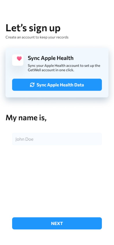
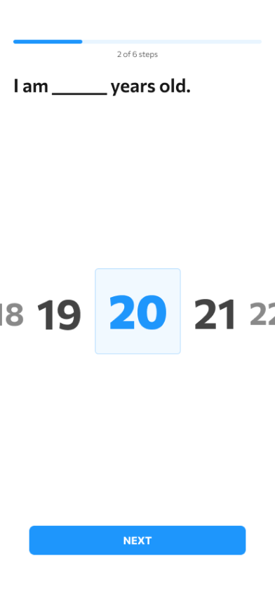
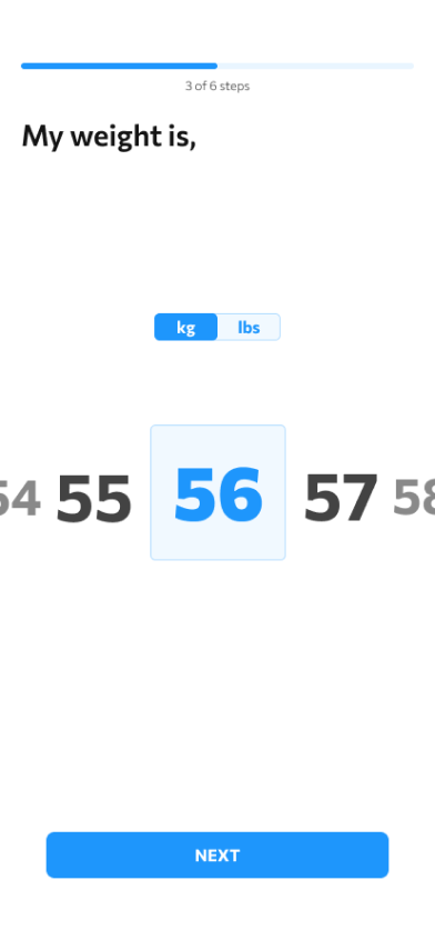
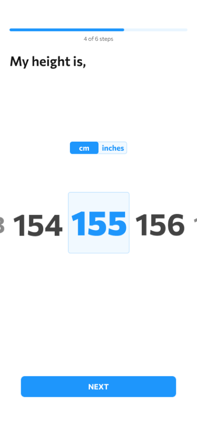
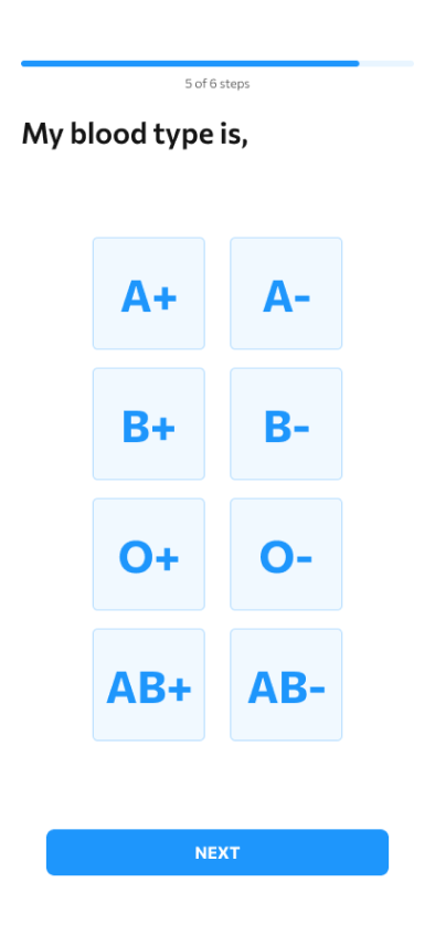
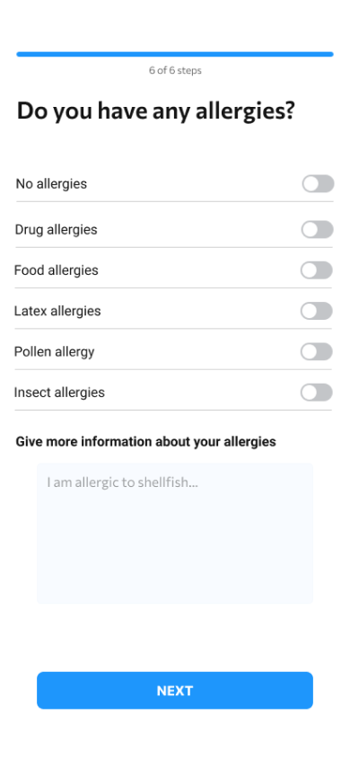
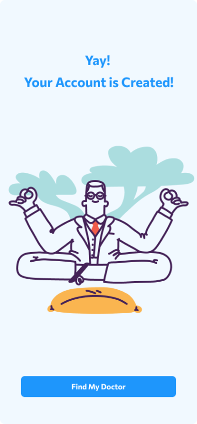
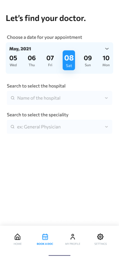
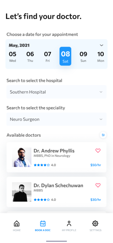
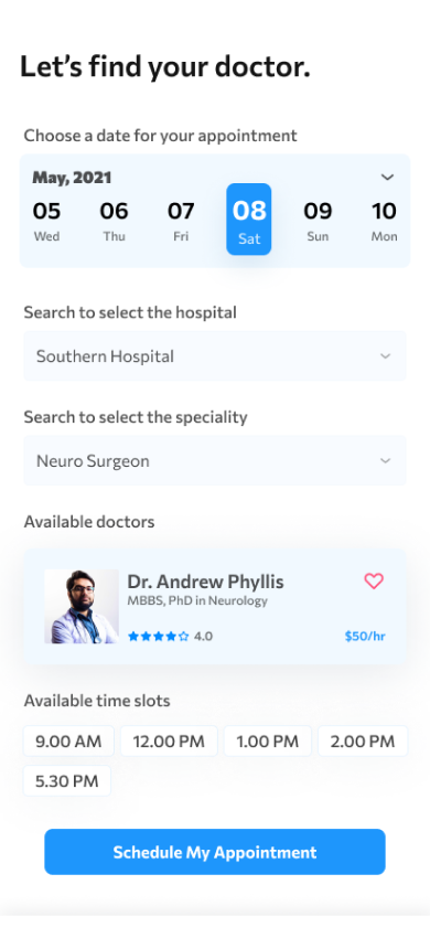
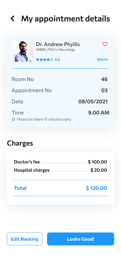
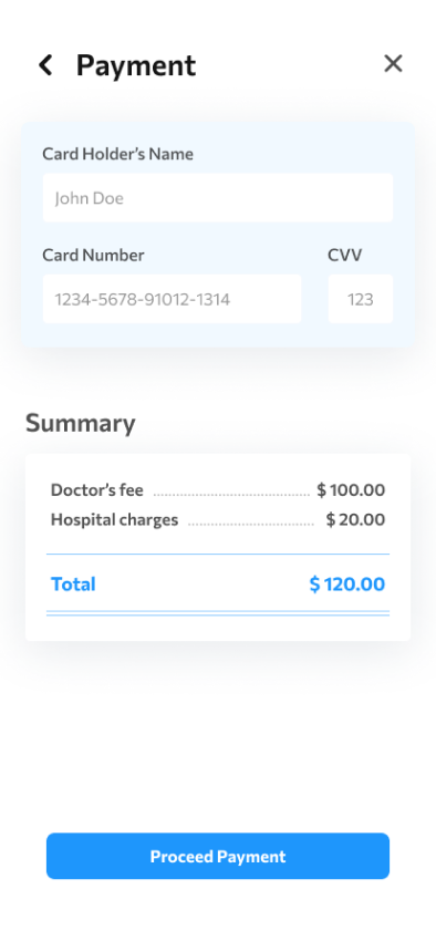
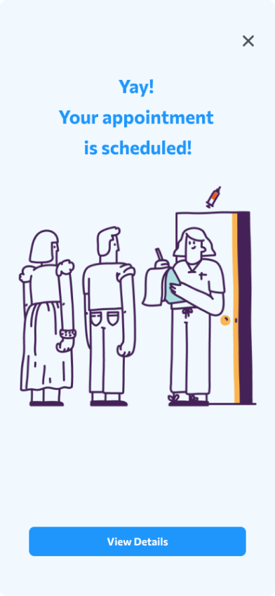
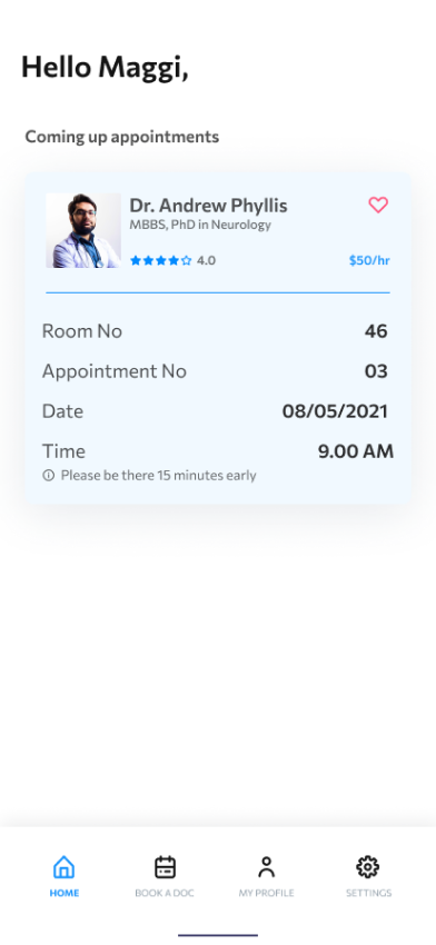
At this point in the design cycle, I began to add colors, images, and icons to our designs. I updated the shape, size, and structure of content borders and sections to high-fidelity versions. I also implemented the feedback I received during usability testing in order to improve the user experience. To do this, I added doctor’s ratings and reviews, so that patients can find out doctors with the trustworthy feeling, added better date selecting options, and showed available doctors more clearly.
HI-FIDELITY PROTOTYPE
I then moved from designing to prototyping to create our hi-fi prototype. I connected all of our screens together into a working version that was representative of our final product. Each page of the design reflected the changes we made as a result of usability testing and worked exactly as the real app would. Then we presented to stakeholders and passed off to the development team for production.
View hi-fi prototypeREFLECTION & TAKEAWAYS
While designing the GetWell app, I learned that the first ideas for the app are only the beginning of the process. Usability studies and peer feedback influenced each iteration of the app’s designs. I also learned that design is a constant iteraion of improving the experience for the end user. User’s feedback plays an essential role to solve the real problems of the user.