About the project
Boondi is a dating app designed for Sri Lanka. It is an app that accustomed according to the Sri Lankan culture and goes beyond the usual dating apps. It is a platform that empower and enable love. cross-team collaboration.
This is a project I contributed end-to-end design through research, wireframing, interaction design, visual design, prototyping and cross-team collaboration.
Role
Tools: Pen & paper, Figma, After Effects
Overview
Although there are a number of world famous dating apps, Sri Lankan people are not comfortable using those. In a more culturally bound country, people need a platform to find their better halves. We found that people are searching for partner for serious relationships which lasts longer with a beautiful marriage. Due to trust and privacy issues, people still use newspaper matrimonial advertisments to find partners. All are searching for a platform that could win theirtrust and feels more secured. Therefore, there is a huge need for a platform that accustomed to Sri Lankan culture.
User Research
In Sri Lanka dating is a sensitive topic for an open discussion. Therefore, to identify the challenges I did a survey. For that, I used a google form and collected data through it.
View the SurveyHere is an extract from the survey results.
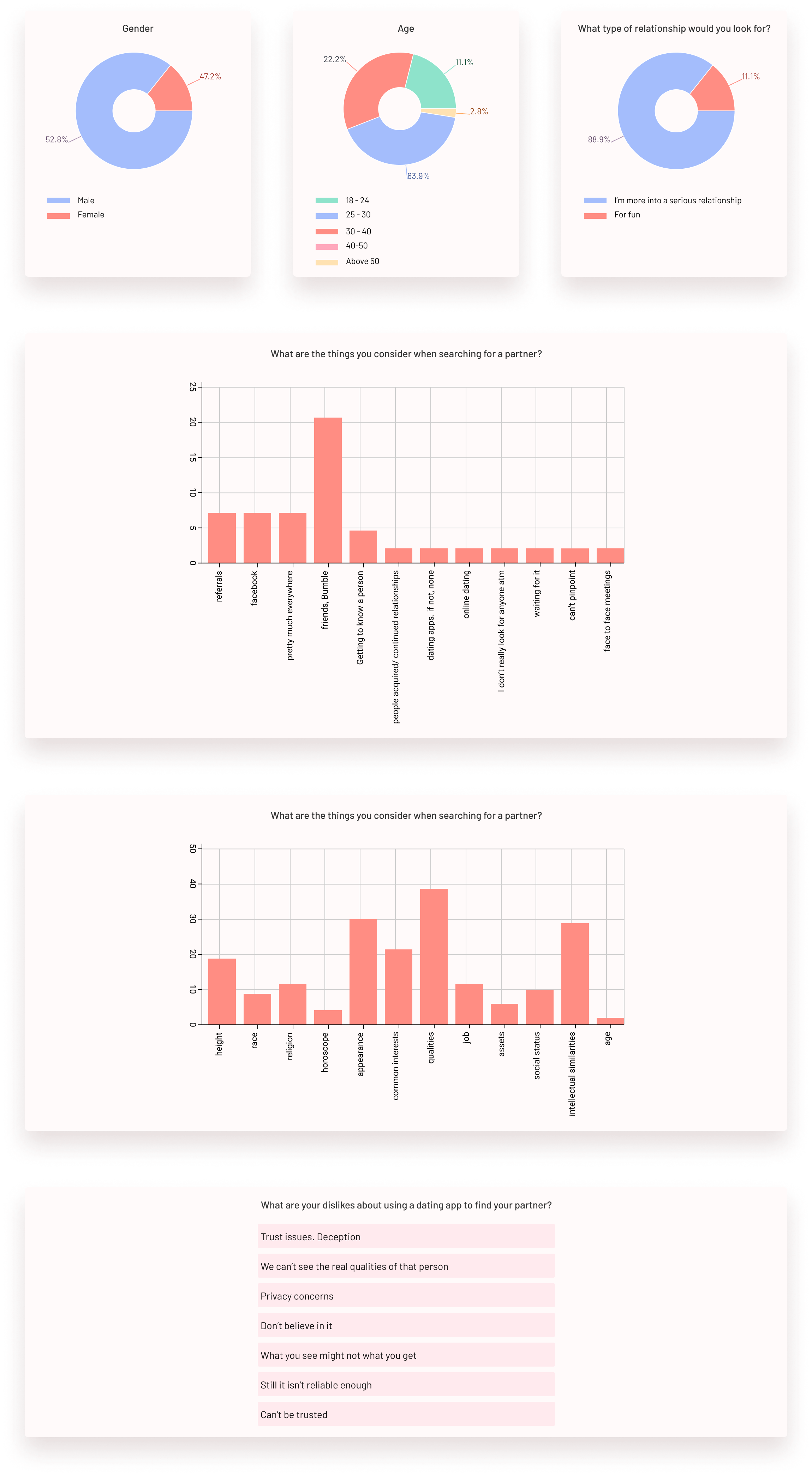
Then did a competitor analysis to identify strategic insights into the features, functions, flows, and feelings evoked by the design solutions of the competitors such as Tinder, Bumble and Coffee meets Bagel.
DEFINING AND IDEATING
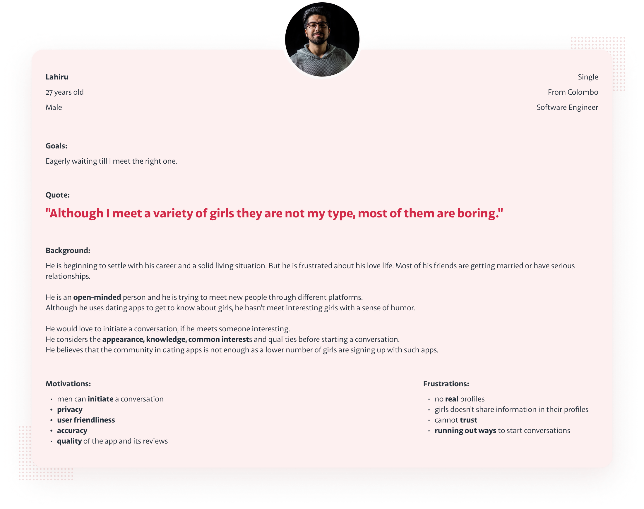
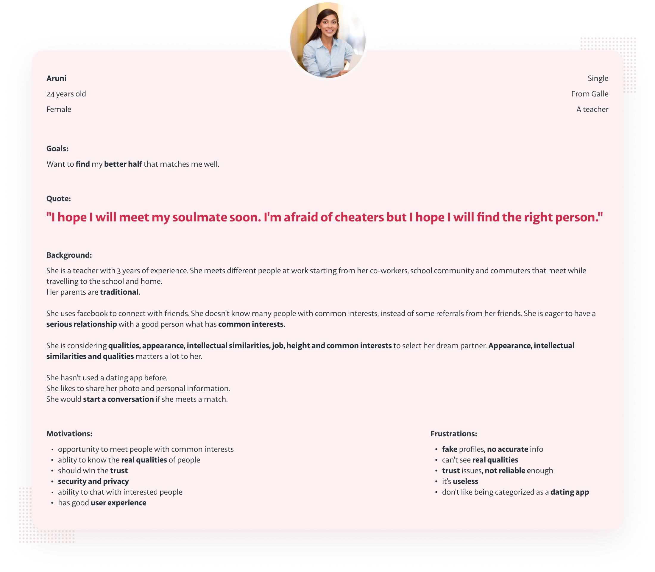
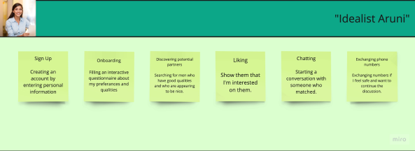
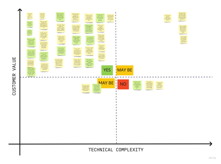
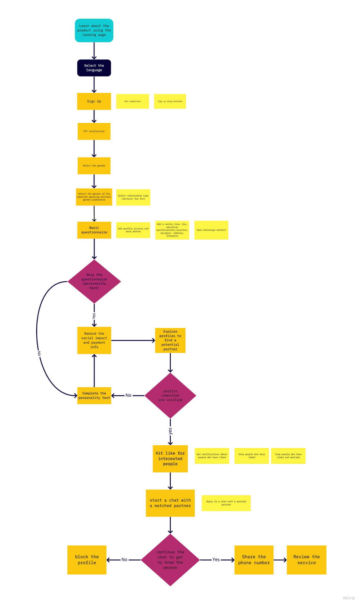
I also had an opportunity to have a conversation with five people who had problems in finding their partners. I used it as user inetrviews to understnad more about their problems and challenges. Using the data gathered from the survey, and the interviews first I created personas. Then, I conducted a workshop to create user journeys according to the personas I created. Then created user stories with the help of the group. Based on the user stories, I conducted a workshop for the prioritization session. With the help of the developer and the user group, we prioritized which is high in customer value and which is low in technical complexity. That helped to identify the features that should be included into our MVP. After the prioritization, I created the user flow to ideate the solution.
PERSONAS
Based on our research, I recongnized that there were two key user types that our product tried to solve problems for. We decided to focus on Persona 1 since their need was greatest.
USER JOURNEY & USER STORIES
Here are some screenshots of user journeys and user stories from my miro board. These data helped me to identify type of features that I should add to the solution.

PRIORITIZATION
Based on these ideas, then, I created a prioritization chart with the help of the developer and the team. It helped to identify which features should be included into the MVP.
USER FLOW
Design
WIREFRAMING
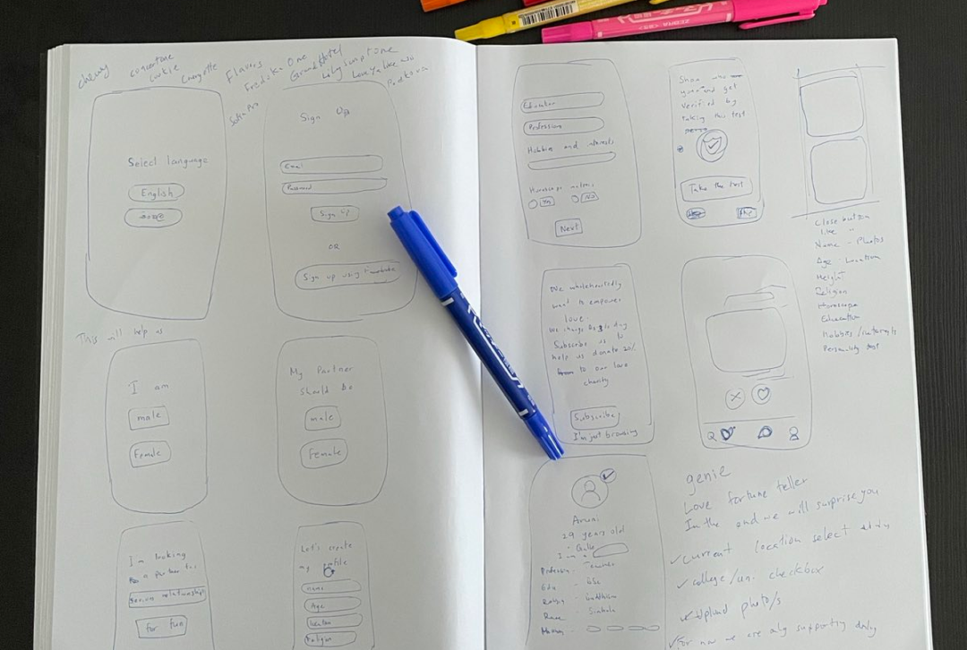
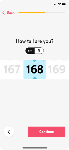
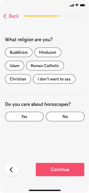
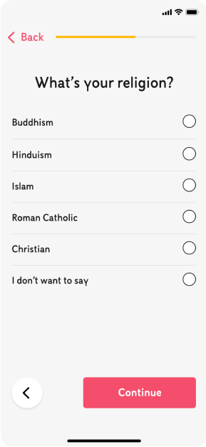
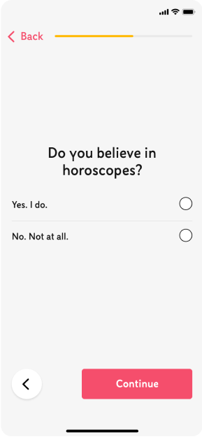
Before moving into high fidelity wireframes and mocks, I wanted to get a feel for what the core of the app would look like when put in front of me. After forming the research findings, I came up with few design ideas that tackled the problem space and seletced the one that works for the MVP and improved it for the hi-fi mockups.
VISUAL DESIGN
Colors
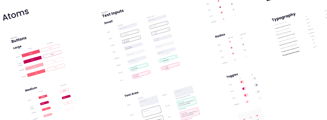
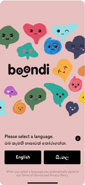
Mix of pink and gray is associated with love, romance, trust, passion, excitement, and can elicit strong reactions. These features fit perfectly to a platform of love.
Typography
Semi-condensed geometric shaped typeface gives a breath of freshness, modernity, and gives the impression of being user-friendly.

Since this app was a bilingual app, I used a Sinhalese font for the second language.

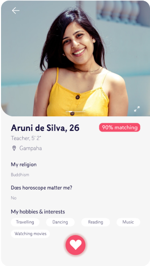
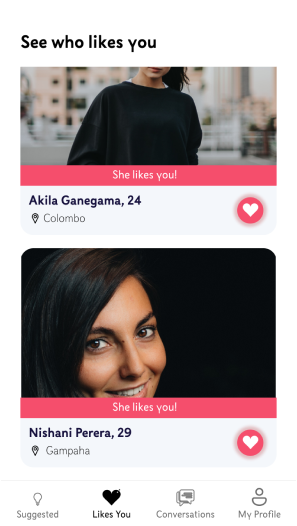
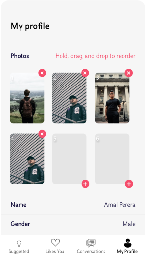
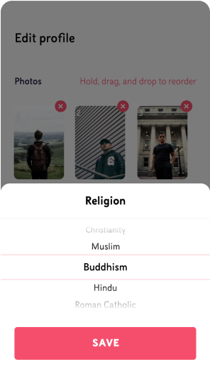
APP DESIGN - HI-FI MOCKUPS
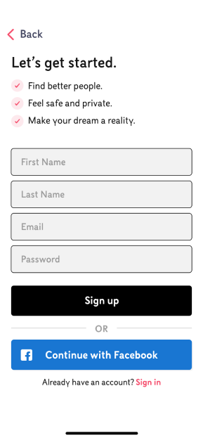
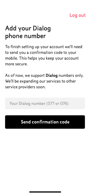
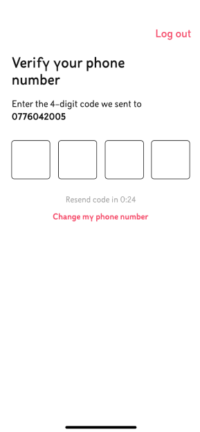
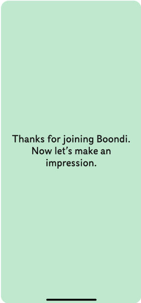
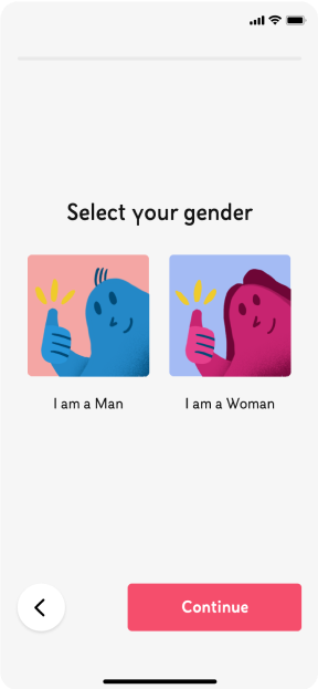
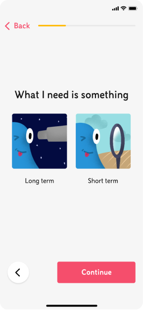
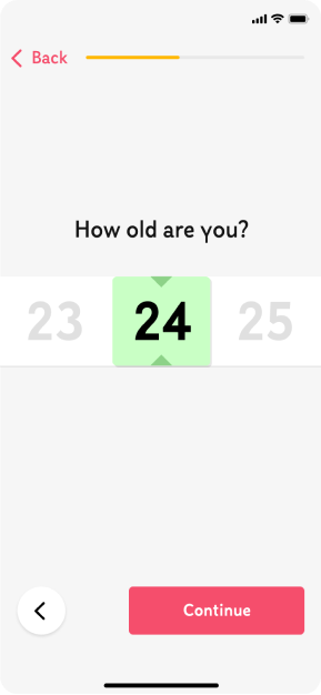
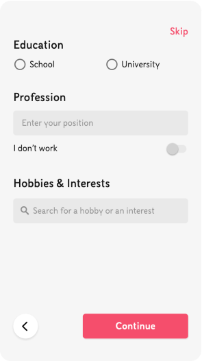
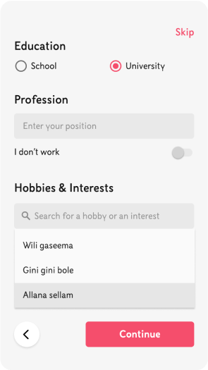
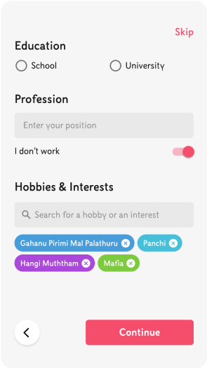
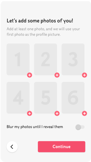
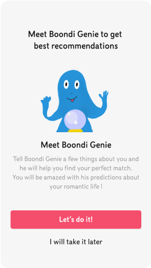
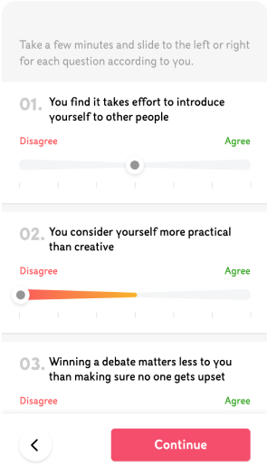
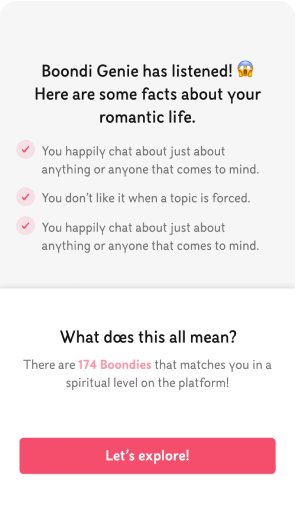
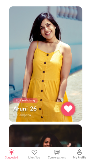
Since majority of the Sri Lankans use android phones, we had to create a cross platform design. Here are some mock ups from both iOS and Android versions.
I have collaborated the branding direction and creative stratergy with Praveen Chandimal.(@huenatic) Checkout some of his badass designs here: https://prvn.ch/
To make the visual of the app more attentive I have used pink color with some attractive pastel colors to get the users attention, also I tried to keep the design as minimal as possible. Though there is a variety of the user groups for this app, I focused on making the interface friendly for all type of users. Moreover, I focused on giving the best user experience while improving the design for more user retention. Also, I focused on keeping the design more developer friendly, so that the developers can easily develop the design. I also contributed by creating lottie animations for simple interactions.
WORKING WITH DEVELOPERS
I worked closely with two engineers to develop the designs for MVP. I explained how this work using a prototype and explain where micro interactions are needed. I also encouraged them to look into flutter components and helped them finding flutter components that makes their work easy.
TAKEAWAYS
This project was an eye-opening experience that taught me a lot about being lean and the importance of understanding the user behaviour. I learned that although there are many features, it is important to focus on the features that you can implement quickly for the MVP while delivering the highest value for the users. I learned that assessing the user flow is important and testing the initial designs before creating hi-fi mock ups helps to manage the timeline.
